I have never been happy with the Text Find & Replace panel in my applications (Script Debugger and Affrus). I started with a version of the Find panel that first appeared in Apple’s Text Edit and many other early Mac OS X applications. Here’s an example from the currently shipping version of Script Debugger 4.5:
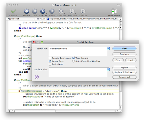
The problem here is that the user has to switch their focus away from the text they are editing to the Find & Replace panel. They have to manage the Find panel window by summoning it, closing it, and moving it out of the way if the text they search for lies behind the window.
Then, Xcode came along with its Find & Replace panel integrated directly into the text editor window (similar to how Safari integrated its text search directly into the web browser window):
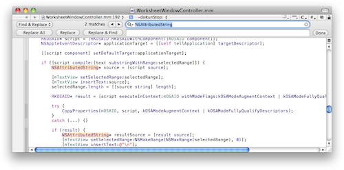
I came to admire this UI in my day-to-day development and copied it for Affrus 2. However, very quickly my Tech Writer and collaborator Matt Neuburg complained that he didn’t like it because he could not easily see or control the find options (Regular Expressions, Match Words, Ignore Case, etc.). I had a search field popup menu that provided access to these features, but it was not obvious and was clumsy to use. To solve this problem I expanded the inline find panel a little to make these options visible and easily changed. Here’s how this appears in Affrus 2 Alpha:
The problem here is that the inline Find & Replace panel is starting to use up too much valuable vertical space in the window and there are a lot of tightly packed small controls that are difficult to use.
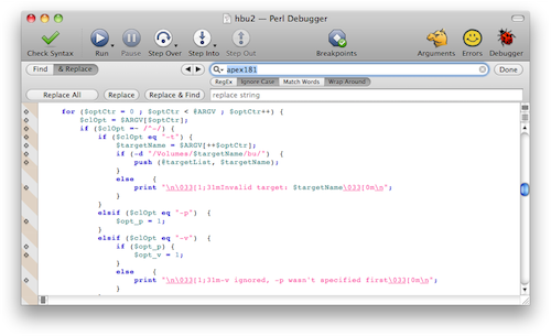
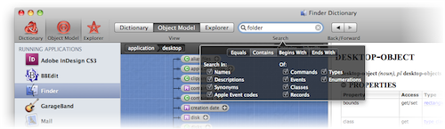
As I was working on a related problem in Script Debugger 5, I came across an idea. Script Debugger 4.5’s dictionary window has a search field in its toolbar. This search field includes a popup menu where the user can control the scope of the search:
This UI was a total failure. The users who were lucky enough to discover these search options found the menu difficult to use as they had to make several trips through the menu to configure the search.
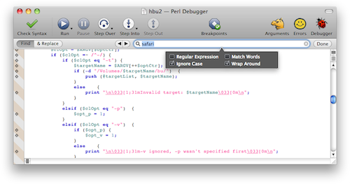
I came across Matt Gemmell’s MAAttachedWindow NSWindow implementation which gave me the idea of placing the search options in a window that only appears when keyboard focus is in the search field:
While I still am not totally happy with the popup window’s appearance and reability, its functionally is dramatically better than the Script Debugger 4.5 approach. The problem of users failing to discover these options totally goes away.
Applying this design to the inline Text Find & Replace, I came up with this:
This design seems to allow one to have a minimalist Find & Replace panel within an editing window while still offering a usable and discoverable range of search options to the user.
It would appear that the attached window would continue to obscure the window content if you were to use Return/Shift-Return with keyboard focus in the search field to go through the matches (communicated better in Safari and BBEdit than in Xcode, which just flashes the focus ring rather than highlighting the ▶ button). One alternative would be placing the attached window on top of the field instead (obscuring the toolbar, but it’d be possible to drag it out of the way). I thought of a bunch of ways you could summon the attached window on demand or automatically hide it on a search, but that’d mean you could get confused why your non-regex search wasn’t matching because regex searching was turned on, or not be able to turn a case-sensitive search into a case-insensitive one when you didn’t match what you wanted.
My favorite design feature of the integrated Find is how it does its best not to disturb the scroll state of the document. Safari does this perfectly, Xcode almost does it (it’s one pixel off, at least in my configuration) and BBEdit doesn’t do it at all—hopefully your Script Debugger implementation gets it right.
Do you always keep that popover visible? Seems like that would be in the way just like a regular window, wouldn’t it? Kinda thinking a good compromise would be an “options” button that shows the popover.
Looks nice, definitely an improvement if you’re going with the in-window behavior and removes the infuriating slow to use pulldowns.
Credit should probably go to Panic’s Coda for the in-window Find&Replace that Xcode now uses. It was there well before Xcode starting using it.
(Unfortunately I strongly dislike it in both apps)
The popover window is only visible when the search field has keyboard focus. Clicking in the editor pane, tabbing out of the search field, or pressing Escape to hide the find panel all cause the popover window to be removed.
I’m a big fan of integrated find as well. But I think the transparent window looks clumsy and that people who are geeky enough to use regular expressions are likely enough to find the small submenu.
Another approach to the Find feature which I find very useful in some Linux editors is that – not unlike Safari – they simply highlight all search results at once, giving you an instant overview.
You may also find Pierre Igot’s posts on this issue interesting, btw: http://www.betalogue.com/2011/01/05/word2011-searchui/
Nice of Matt to share that; this is the sort of thing that lots of people and/or corporations are patenting these days (e.g. the “pull down to refresh” paradigm in iOS)…
I like the Safari method of immediately highlighting all the hits, but for large documents or blocks of code, it almost needs it’s own shadow window as a way to display how many results there are and how they are scattered through the document.
Why not make the popover window only appear when the user mouses over the text field for a time?
Most users will move the mouse to the search field at some point anyway. The options will become evident, they’ll select the ones they like, but then when they search, the box fades away again and only the content remains.
I love this idea, but I think the popover would look better if it was the same color as (or perhaps a lighter version of) a standard window, and opaque. If I remember correctly, MAAttachedWindow has color options built in, so that could be an easy way to improve the look.
I also like Nicholas’ idea of having it on top of the field to avoid obscuring any text.
Hmm… I never really thought about the find and replace window, but you raise a really good point. Is it possible that Vim has the best UI in one category at least?
I think it may be…
I dig it. I think Christopher LLoyd is correct about Xcode borrowing Coda’s interface, but Coda’s is (now?) more compact by default and uses popup menu buttons exclusively to maximize vertical space. It still has an option that expands the find banner to give you more room for the search terms, to. I fully support any integrated solution over Textmate’s loathsome find window though.
Does the popover window remain visible if you tab to its controls? Does pressing the Tab key advance the focus into the popover window? That would make sense. Only when you tab away from the last control would it disappear.
BBEdit’s window annoyed me initially, but I have been using it for so long that my mind automatically works around it. What might be interesting is having Command-F doing a normal search with a basic pane, while Shift-Command-F brings up the more advanced pane with more options for the search.
This thing work in VoiceOver?
I think you (and the XCode team) dismissed the dialog option too hastily. I don’t think the problem of switching focus to a separate dialog really comes up in practice, or at least doesn’t demand much more attention than the search bar. In both cases, the basic search goes “Command-F type/paste the search phrase hit Enter”, and then Command-G does Find Again. If you need a more complex search, better a dialog with obvious, standard controls than any of a dozen custom implementations that offer less space for advanced functionality (e.g., yours doesn’t look like it support multiline search). I also don’t think dialog management proves much of a problem. With modern wide displays, you can put the search dialog to one side, out of the way, once, and a decent text editor will open it there in future uses. You also don’t lose the vertical space like you do with a search bar, which I consider much more valuable when editing text. For reference, I pretty much live in BBEdit and their Find dialogs feel better than any other search I’ve used.
Interesting approach, but visually distracting (inverted colors) and confusing: I’d consider this bubble an explanation about</> the field its attached to, not an extensions of its features. Revert the colors, attach the pane above the find field and below the replace field, remove the space of the triangle/arrow. But then, I’d like the Coda approach more, where find and replace are placed side by side (latest displays all go widescreen) and the line with the “find” or “replace” buttons could be used for options too.
Textmate’s “normal” Find+Replace window is quite “classic” but the Find+Replace In Project is pure genius and allows to efficiently find, pick and replace across hundreds of files in a blink.
I’ve always been a fan of SubEthaEdit’s Find & Replace floating window. The text fields are multiline (where option-return enters a newline), regex options show up in a drawer when selected, and Find All shows a separate matches window highlighting regex groups. They’ve thought through the focus issues thoroughly so I never find it an issue — cmd-F, cmd-E, cmd-G, tab, enter, and cmd-W always seem to do the right thing as far as shifting focus goes.
I like the idea, but I’m not a fan of the white on black hovering window user interface. It seems unprofessional to me… a conventional dropdown pane would serve the same purpose and look less than a last-minute plugin.
Maybe you should sometimes look over the shoulders of others; for example R# (Resharper) does something really smart to let the user replace text: after you press the hotkey to invoke replace you simple type over the first occurrance of the expression “inside your edit window” and press enter to replace all occurrances. I admit there are no options to set in this solution but it works perfect for 90% of the replacements. The remaining 10% the user can deal with a dialog.
I really do appreciate the attempts to improve things, but I think this is a tempest in a teapot. The old-school dialog has never been a problem, is not distracting and is entirely functional and useful.
It also has the added bonus of being completely understandable by anyone who looks at it. There is no question about what its function is, what it supports, or where the options are hiding.
Think of all the different ways we’ve tried to mess with the stick shift location since the invention of the automobile. And where is it today? Back where it started. On the floor, just to the right of the driver (or left in those “other side” countries). Sometimes the best solution is already present.
I’m liking the direction you’re going with ‘find’. One thing I’d like to see is the various ‘find’ options available via Applescript. That way it’s easy for the user to set up templates such as ‘clear-all-options’, ‘regex-case-insensitive’, etc. to their heart’s content and bind them to keyboard shortcuts as desired.
[…] Alldritt suggests a variation that uses a popover to mitigate the screen real estate […]